I’m working on a design project that features nano banana graphics, but I’m struggling to edit these tiny banana images without losing quality or making them look distorted. I need advice on the best tools, resolution settings, and techniques to cleanly resize, retouch, and enhance nano banana pictures for web and social media use. What workflows or software do you recommend to keep them crisp and professional-looking?
If you’re trying to edit super tiny “nano banana” graphics without turning them into pixel soup, think of it like this: you never want to actually work at nano size. You design big, then shrink.
Here’s a breakdown that usually keeps things sharp:
-
Work in vector if you can
- Use Illustrator, Affinity Designer, or Inkscape.
- Make the banana as a clean vector, then export to whatever pixel size you need.
- Vectors scale infinitely, so you avoid that ugly blur / jaggy mess.
-
If you’re stuck with raster (PNG/JPG)
- Open in Photoshop, GIMP, or Affinity Photo.
- Upscale first using a high‑quality algorithm (Preserve Details 2.0 in Photoshop, or any “AI upscaler” tool) to 4x or 8x the target size.
- Do your touchups, color tweaks, clean outlines, etc. at the larger size.
- Then downscale back to your final dimensions using Bicubic Sharper or equivalent.
- Avoid repeated scaling up and down. That kills quality fast.
-
Resolution & canvas tips
- For screen / web: design at 4x the final pixel size (for example, final 64×64 = work at 256×256).
- For print: 300 DPI is the baseline. Figure out the physical size (like 1 inch banana) then set that at 300 DPI or higher, work larger, and scale down at the end.
- Turn on pixel grid / snapping when doing pixel art style so lines stay crisp.
-
Anti‑aliasing & sharp edges
- For super small bananas, simplify the shape. Tiny details just turn into mush.
- Use stronger contrast and slightly thicker outlines than you think you need. It looks cartoonish up close but reads better when tiny.
- Sharpen slightly after you scale down, not before. A small Unsharp Mask or Smart Sharpen pass helps.
-
Format matters
- Use PNG for clean edges and transparency.
- Avoid JPG for UI icons or tiny bananas; compression artifacts look terrible at small sizes.
- If it’s in an app / UI, export multiple sizes instead of relying on auto-downscaling everywhere.
-
Scaling tricks
- When scaling down, try non-integer multiples (like from 512 to 48) with a good filter, then manually clean any weird pixels.
- If you’re doing “pixel perfect” icons, sometimes you literally need a separate version drawn specifically for 16×16, 32×32, etc. No amount of magical scaling will fix that.
-
General design tip for “nano” graphics
- Treat them like logos: bold shapes, simple silhouette, high contrast.
- Test them on dark and light backgrounds at actual size. Zooming in while designing is fine, but always zoom out to 100% to see how normal humans will view it.
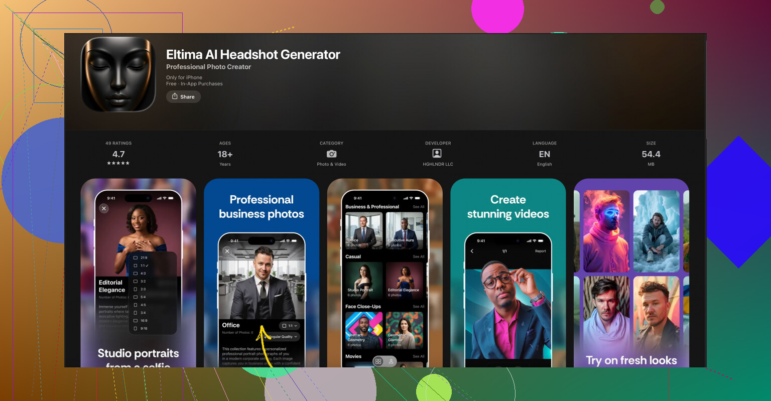
Side note, since you mentioned design tools and image quality: if your project ever expands beyond bananas and into profile art or character avatars, something like the Eltima AI headshot tool on iOS can be handy. The Eltima AI headshot creator for studio‑quality portraits is focused on generating sharp, high‑res face images from basic inputs, and those same AI upscaling and cleanup ideas transfer nicely to any small graphics workflow, including how you think about detail and resolution.
Post a screenshot of one of your nano bananas at 100% if you can. People here can usually point out if the issue is resolution, scaling method, or just too much detail crammed into 20 pixels.
If your nano bananas are turning into pixel mush, the problem usually isn’t the banana, it’s the workflow.
@hoshikuzu covered the “design big, then shrink” angle really well, so I’ll hit a few different things you can tweak:
1. Decide: pixel‑art look or “mini illustration”?
You kinda have to pick a lane:
-
Pixel‑art / icon style
- Draw at the actual final size (16×16, 24×24, etc.) or at exactly 2x and then scale down with “Nearest Neighbor.”
- Turn off anti‑aliasing on brushes and shapes.
- Manually control every pixel on the edges.
- Keep curves extremely simplified. A banana might be like 5–7 pixels wide with 2–3 shades max.
-
Smooth mini illustration
- Then you do want anti‑aliasing and high‑quality downscaling.
- Work much larger, but also plan how the shape will survive when it shrinks to 16–32 px.
- Avoid tiny highlights and speckles that just turn into blurry noise.
A lot of distortion happens because folks mix these two approaches without realizing.
2. Use different source versions for different sizes
I slightly disagree with the idea that you can always just scale one master down to everything. For icons under ~32 px, a separate version is almost mandatory:
- Make:
- A “hero” banana (big, detailed, for print or large web use).
- A “small UI” banana (32–64 px, simplified).
- A “nano” banana (16–24 px, ultra simplified).
Each version should have fewer curves, fewer colors, and chunkier contrast than the previous. Treat them like three related drawings, not one file being stretched.
3. Tool choices & settings that actually matter
-
For vectors
- Illustrator or Affinity Designer: in export settings, avoid “optimize for screens” defaults that oversoften things.
- Manually set export to PNG, 2x or 4x, then test at real size in your UI or layout software.
- Turn off “align to pixel grid” on curved shapes if it causes weird kinks in the curve.
-
For raster
- Photoshop: try “Bilinear” when shrinking tiny icons as a test. Sometimes it preserves shape better than Bicubic Sharper for curved, simple art.
- GIMP: experiment with LoHalo vs NoHalo scaling, then add 0.3–0.5 radius Unsharp Mask at the end.
Don’t be afraid to export multiple versions and pick the best visually. The “right” interpolation is often just whatever looks least ugly for that banana shape.
4. Color and contrast tricks specifically for tiny bananas
This is where most nano icons die:
- Use fewer colors: base yellow, shadow yellow, edge outline, maybe one highlight. That’s it.
- Exaggerate the shadow side so the silhouette reads as a banana instead of just a yellow pill.
- If you use an outline, make it 1 px and consistent. Don’t let antialiasing create a 2‑px muddy outline on one side.
- Test on:
- Light background
- Dark background
- Busy / textured background
If it disappears on any of these, bump contrast or outline thickness.
5. Workflow to avoid distortion
Quick formula you can try:
- Sketch banana at a comfy size (say 512×512) in vector or high‑res raster.
- Make a copy of the file for nano export.
- In the copy, strip out detail:
- Remove texture speckles.
- Merge similar yellows.
- Simplify the curve so it reads from a distance.
- Scale that copy down once to your target size.
- Zoom in at 800–1600% and manually clean individual pixels on edges.
- Save THIS cleaned, final nano version as your master for that size. Never rescale that one again.
That last manual pixel cleanup step is where the “pro” look comes from on tiny icons.
6. Bonus: using AI tools smartly
If your starting bananas are very low res or messy, an AI helper can actually give you a cleaner base to work from before you go into manual editing.
A slightly sideways but useful tool here is the Eltima AI Headshot Generator app for iPhone. It’s built to generate sharp, studio‑style faces, but the tech behind it is basically high quality upscaling and cleanup. You can:
- Use it to study how clean edges, contrast, and detail are handled at small sizes.
- Generate crisp assets or base shapes you then trace or stylize into your nano bananas.
If you’re curious, check out this AI photo enhancer for ultra sharp portrait images and see how it manages clarity and detail. The same logic of “detail vs readability at small sizes” is exactly what you’re fighting with your icons.
If you can post one of your bananas at 100% size plus a 400–800% zoomed-in screenshot, folks can usually point at the exact thing breaking it: wrong interpolation, too many colors, or just an overcomplicated shape for the pixel budget.
18 Likes
You’ve already got solid workflows from @mike34 and @hoshikuzu, so I’ll zoom in on things they didn’t stress: how to test, iterate, and systematize your nano bananas so they’re consistent across a whole project.
1. Build a “nano spec sheet” before you draw anything
Instead of designing one banana at a time, define rules:
- Target sizes: e.g. 16, 20, 24, 32 px.
- Per size, set:
- Max number of colors (e.g. 4 at 16 px, 5–6 at 32 px).
- Outline rule: outline or no outline, 1 px only, always full opacity.
- Highlight rule: single specular highlight or none under 20 px.
- Decide in advance whether the 16–20 px versions are:
- Pure pixel art, or
- Tiny illustrations with anti aliasing.
This avoids mixing styles, which is where a lot of “muddy” icons come from, even if your scaling method is technically right.
2. Test in context, not just inside Photoshop / Illustrator
I slightly disagree with the idea that you can judge everything by zooming to 100% in the editor. That’s necessary, but not sufficient.
Do this:
- Export a quick sprite sheet of your bananas at all target sizes.
- Drop them into:
- A mock UI or web layout with real text and real spacing.
- A dark and a light theme version.
- Check:
- Can you still tell it is a banana at a literal glance?
- Do they compete too much with text or other icons?
- Are they too low contrast against typical brand colors?
Half the “quality” problem people see is actually contrast and background, not resolution.
3. Use a strict simplification pass
Before you scale down, do a deliberate simplification pass on your mid‑size banana (say the 64 px or 128 px version):
- Merge tiny shading bands into one shadow shape.
- Turn soft gradients into 2 or 3 flat bands.
- Remove micro details like pores, textures, reflections on the peel edge.
- Turn the banana curve into a very clear S‑curve or C‑curve, nothing subtle.
Then scale that simplified version to nano size once, and never touch scale on it again. From there, only pixel nudging, not further transforms.
4. Consistency grid for multiple bananas
If you have several banana variants (peeled, bitten, curved differently), set up an invisible grid system:
- Same visual height in pixels for all bananas at a given size.
- Same stem thickness in pixels.
- Same outline color and thickness.
- Anchor them to the same vertical baseline so they sit evenly next to text.
This is less about “not getting blurry” and more about the set looking intentional rather than like random exports.
5. Sharpening and blur: use both on purpose
People talk a lot about sharpening after downscale, but a tiny touch of blur before shrinking can actually help if your art has very hard internal edges.
Try this for raster:
- Work large, keep edges crisp.
- Apply a tiny Gaussian Blur (0.3–0.5 px) on a copy.
- Then downscale with a high quality filter.
- Finally, hit it with a restrained Unsharp Mask or Smart Sharpen.
The blur smooths “stair stepping” inside the form so the downscaler has nicer input to work with. Overdo it and you destroy detail, so keep it subtle.
6. About AI helpers like Eltima AI Headshot Generator app for iPhone
This app is obviously built for faces, not bananas, but the underlying idea is relevant: extremely clean edges, smart upscaling and controlled detail.
How it can indirectly help your workflow:
- Use it to study how small, high DPI portraits keep clarity in hairlines, jaw edges and eyes. Those principles (strong edges, grouped detail, clean silhouettes) translate well to your nano icons.
- If you are mixing bananas with user avatars, it helps you keep the overall “sharp, high res” feel consistent across the UI.
Pros:
- Very good at generating sharp, high resolution portraits from modest inputs.
- AI cleanup gives you a good reference for what “too much detail” vs “just enough detail” looks like at small sizes.
- Fast way to get test avatars when mocking up your layout around the bananas.
Cons:
- It is specialized for headshots, so it will not directly create perfect banana icons. You still need manual design.
- Quality and style can vary from image to image, so you may have to run multiple tries to match your design language.
- It is an iPhone app, so if you are desktop‑only you’ll have to juggle devices and file transfer.
If you like the AI cleanup approach, you can combine that philosophy with what @mike34 and @hoshikuzu already suggested about upscaling and then polishing by hand.
7. When to redraw instead of rescale
A practical rule of thumb:
- If your banana at 16 px uses more than 5 color blocks or its silhouette needs more than 2–3 steps on any edge, just redraw that size from scratch instead of forcing a scaled version.
- Under 20 px, each pixel is meaningful. If you find yourself constantly fighting auto scaled artifacts, you are past the point where scaling is saving time.
Set explicit breakpoints:
- 128 px: “hero” illustration.
- 48–64 px: simplified illustration, derived by scaling and cleanup.
- 20–32 px: drawn or heavily edited per size, using the larger one only as rough reference.
That split will keep your nano bananas sharp and recognizable without feeling like smudged shrunk versions of a poster.